
The basics
PRODUCT PREVIEW


TIMELINE
4 weeks
ROLE
Sole designer
RESPONSIBILITES
Branding, Graphic Design, Packageing Design
Summary
My impact
I planned and implemented the project.
Actions taken
Research: Market research, interviews with the target group, testing.
Problems/opportunities identified
1# Branding
How to evolve the brand but still keep the "Snow Peak style".
2# Product
An opening for a new product on the market was spotted.
Goal
To re-brand Snow Peak and to create a package design for coffee.
Result
Added colours in Snow Peaks graphic profile, a new logotype and a package design.
Problem
1# Branding
"How would I rebrand Snow Peak and keep their style - yet make something new, fun and useful to add value to their brand?"
2# Product
"How do I make a new product convinient for campers to bring and enjoy in nature?
The problem
Background and needs
Snow Peak
Snow Peak is a brand that makes camping gear - but differentiate from their competitors by also creating a community with events and a place to connect between like minded. Their products are of high quality and the price range is a bit more to the luxury side.

The users
Customers
Target group
HOW I WORKED WITH USERS
Qualitative Research
In this project, I mainly worked with qualitative interviews to get a deeper understanding of the target grop.

The solution
REBRANDING
Brand book
2# - product/package design
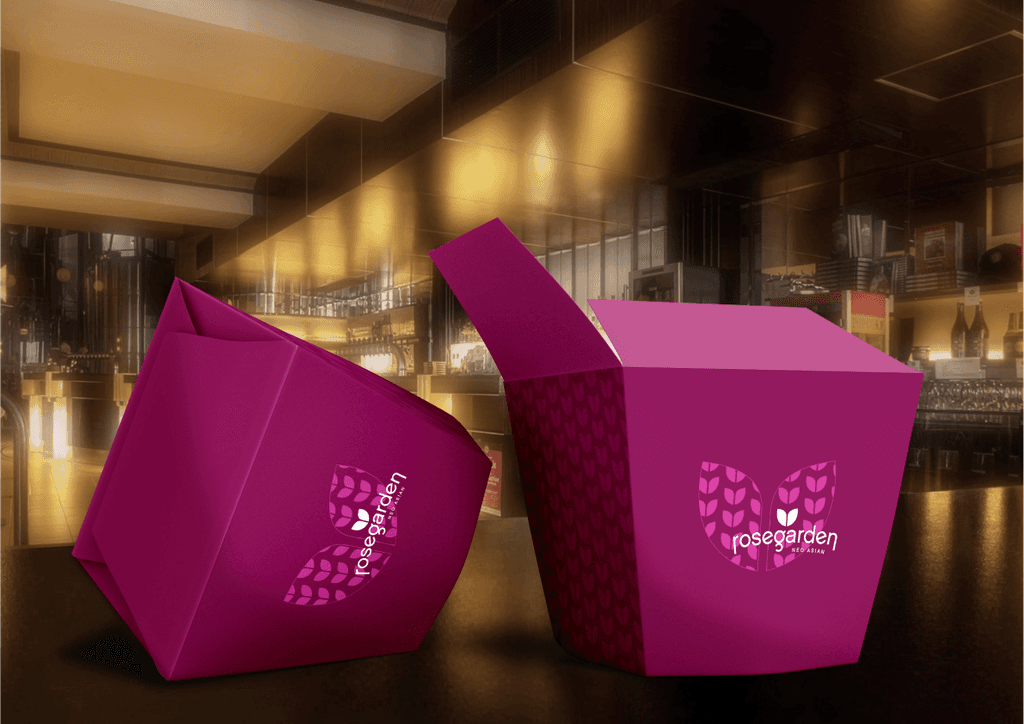
Camping Coffee for two
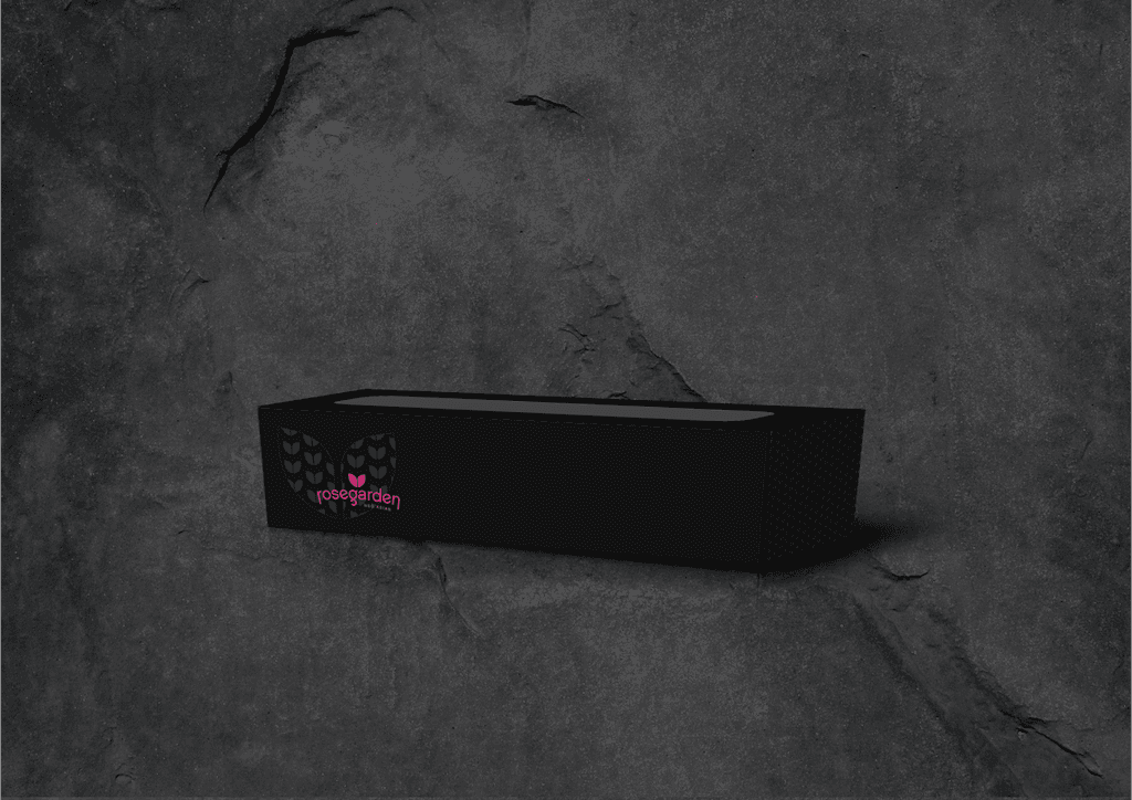
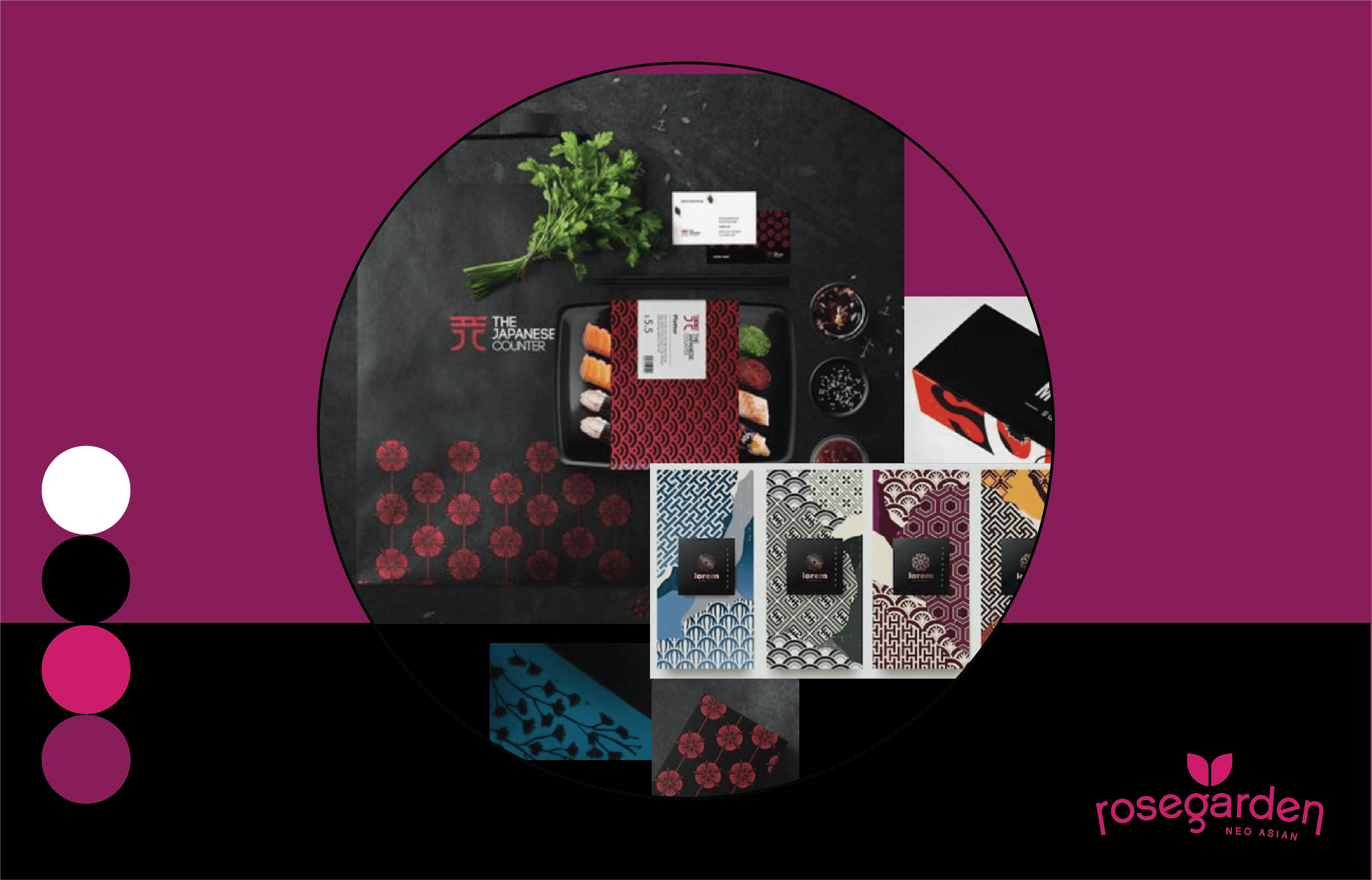
The chosen concept consists of a monochrome pattern against the background color and with a logo in an accent color that makes it stand out against pattern and background. The boxes vary in color where the sushi box is black, bowl is pink and box is purple. This is to create a variety and a subtle playfulness in the concept.
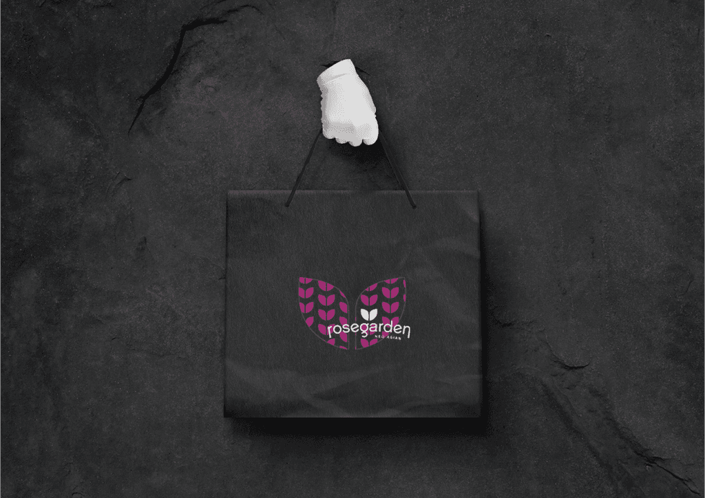
The low budget bags are selected in Rose Gardens signature colors pink and purple. These are the colors that are best seen and differentiated from the amount in an urban environment. The chopsticks are designed in black, pink and purple for variety.
My focus group that evaluated the final result gave, among other things, the feedback:
“Feels like Rose Garden” - Martin & Yan
“Wow!” - John
"Cool!" - Caroline
FInished products:
Packages
FINISHED PRODUCT:
Reflections
In a fictitious project, I would have wanted the pattern, which in the result appears as a change of tone in the color, had been an embossing (pressed down) with higher gloss level instead. It would have given a slightly more exclusive and even more subtle feel, but in a reality where money rules, I ruled out that as a proposition for this client, as it was quite clear from the start that it was a little more low price product that was in demand. The challenge was instead in making a product which felt a bit more exclusive but with simple means.